1. Explore the color wheel at https://www.canva.com/colors/color-wheel/ and define
the following using writing for the web techniques discussed earlier:
a. Complementary colors: Multiple colors that Contrast each other, can be used to draw focus to a certain area.
b. Monochromatic: Three of the same color with different tones and tints (for example, three different shades of blue), can be used to give a site a sense of identity
c. Analogous: Three colors next to each other on the color wheel, if balanced incorrectly can affect the readability of the site. Designers usually choose one color as a base, then use the others for accents.
d. Triadic: three colors that are evenly spaced on the color wheel, creating a triangle. Designers use this type of pallet because the colors contrast while also having balance.
e. Tetradic: Four colors that create a perfect circle on the color wheel. The extra color can make it harder to balance. The more colors that get added, the harder it is to draw viewers’ attention towards an area.
f. Primary: The base colors of the “color wheel” that make up RGB (Red, Green and Blue). when added together creates white, allowing you to have negative space.
secondary: The result of mixing two primary colors.
tertiary: The mixture of a primary and secondary color i.e. Blue and Purple.
g. Warm colors: Give a site a calming feeling, though best used with smaller pallets like complementary or chromatic.
h. Shades, tints ad tones: Shades are used by adding black to a color to affect how dark a color is, Tints are the inverse adding white to get the opposite effect and Tones are a mix of both by adding grey to a color.
i. Hue, saturation and luminance: Hue is the base RGB, saturation is how potent the color is in the pallet and luminance is just how bright the color is
2. Pick your favorite color. Identify complementary colors, monochromatic,
analogous and triadic colors of your favorite color. Write down the hexadecimal
numbers or take screenshots if needed.
Blue- 061ef9
- Complementary061EF9, F9E106
- Monochromatic- 061EF9, F9E106
- Analogous- 061EF9, 6706F9, 0698F9
- Triadic- 061EF9, F90698, F9E106, 06F967
3. Visit http://paletton.com to learn about color pallets. Identify three color pallets
that you like the most. Choose one monochromatic, adjacent and triad colors.
Watch the following video if needed:
https://www.youtube.com/watch?v=RPIk4ETyXV8
https://www.youtube.com/watch?v=EWZljdmLTrk
4. Apply the chosen color pallets to web pages. Click Examples, Page layout
(White page, Dark page, Positive page, Negative page). Click Presets,
Previews, Tables/Exports and investigate different color setups as described in
the videos above. Write down few color choices and text combinations you liked.
You can provide some screenshots as well. Unfortunately, Examples seem to be
not working now. Write a paragraph or two describing your Paletton
color choice experience.
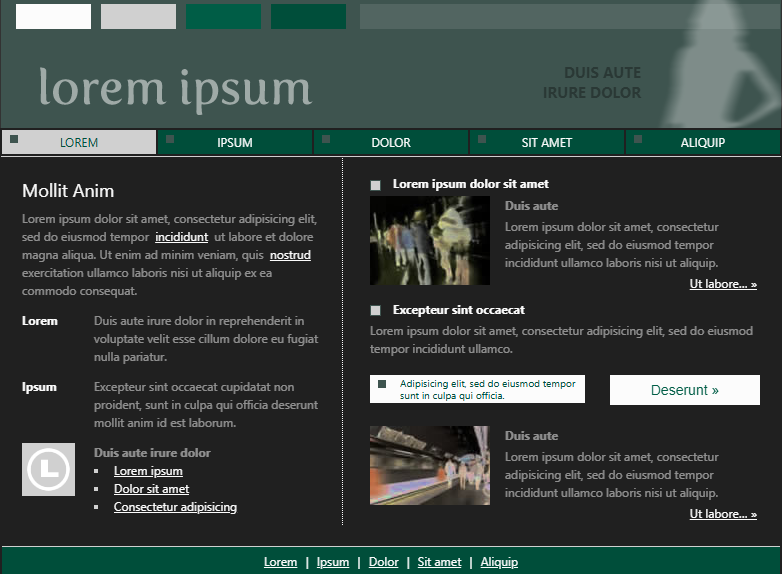
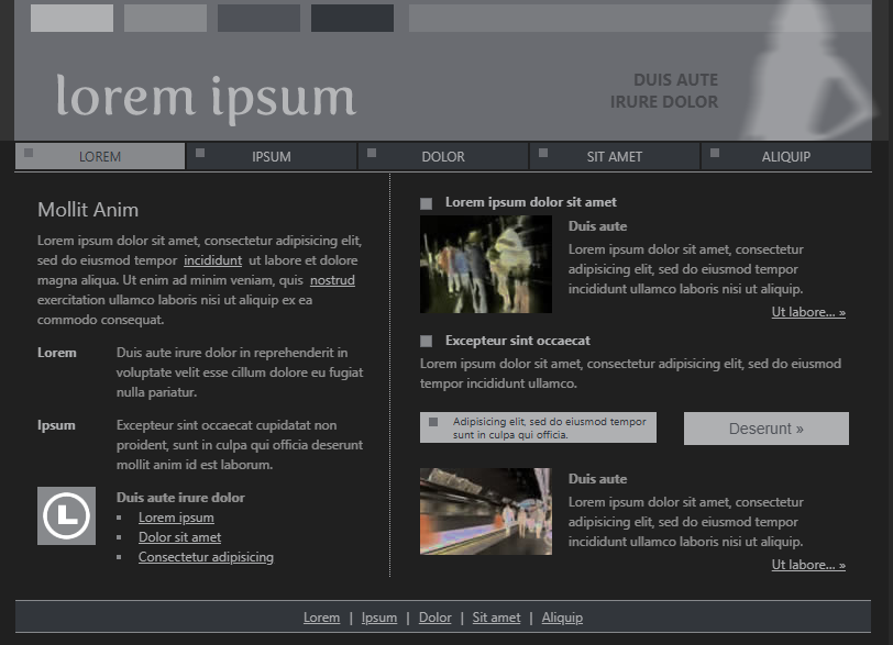
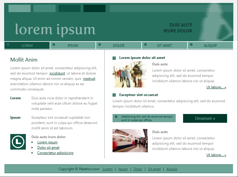
I first chose the base RGB 256E5D hue 203. While viewing the white page example, I noticed that the green contrasted perfectly with the white to make text more legible. Also, the Negative example made the buttons stand out with a darker shade of green. I also liked 696C70 hue 236, specifically because it utilizes a lot of neutral colors that can be used to allow imagery to stand out. The black background on the menu works to enhance the purple and grey colors for the rest of the page. base 0000 and hue 174 works really well for a simple pallet that doesn’t overwhelm the viewer and gives a sense of calm.
5. Take screenshot(s) of the Page Layouts under Examples for each color palette.
6. Visit https://www.canva.com/learn/100-color-combinations/ and identify three color combinations that you like and explain your reasons using chunking of text.
- I liked using a Complementary style using 1C4AE3 and E3B51C. Having blue as a solid base color and adding grey and white creates a good balance of primary and secondary colors.
- Next, I used a tetradic pallet with 639C87 6B639C 9C6378 949C63. I liked utilizing the tetradic pallet because it allows you to make more complex color due to having more colors blending.
- Finaly, I used an analogous pallet with 000E7 2A0070 004670
I Liked this specifically because when used with white text makes the page feel cohesive. Bold color base that allows other aspects of the page to do the work.
7. Find on your own two additional resources related to writing for the web, and color as a web design tool.
- https://fabricweb.z5.web.core.windows.net/pr-deploy-site/refs/heads/master/theming-designer/
- https://pixelied.com/colors/color-palette-generator/purple